Introduction
Every day, your team loses productivity to hurdles of working with data in formats that don't match their needs. Your sales team scrolls endlessly through spreadsheets to find deals, missing opportunities hidden in rows. Your schedulers juggle between systems to avoid double-bookings. Your customers abandon forms because they're too complex. Your executives make decisions based on stale reports because real-time dashboards don't exist. These inefficiencies don't just waste time—they create blind spots, reduce customer satisfaction, and slow your entire operation to the speed of your most cumbersome process.
Interfaces eliminate these bottlenecks by presenting your data exactly how each role needs to see it. Sales visualizes their pipeline as cards moving through stages. Schedulers see everything on an intuitive calendar. Customers complete streamlined forms in seconds. Executives monitor real-time metrics that update automatically. Same data, infinite possibilities—each person works in their optimal format without compromise.
What are Interfaces?
Interfaces are dynamic views that transform how you interact with your data. Build visual experiences without code that match exactly how your team works—from spreadsheet-like tables to drag-and-drop boards to interactive dashboards.
Common use cases include managing project workflows on Kanban boards, tracking schedules with calendar views, analyzing performance through dashboards, collecting data via custom forms, and browsing records with visual card layouts.
Getting Started
Accessing Interfaces
The path to better data visualization begins in any Dataset within your workspace. Look for the interface tabs at the top of your data view—these represent different ways to visualize and interact with the same information. Click any tab to instantly transform how you see your data.
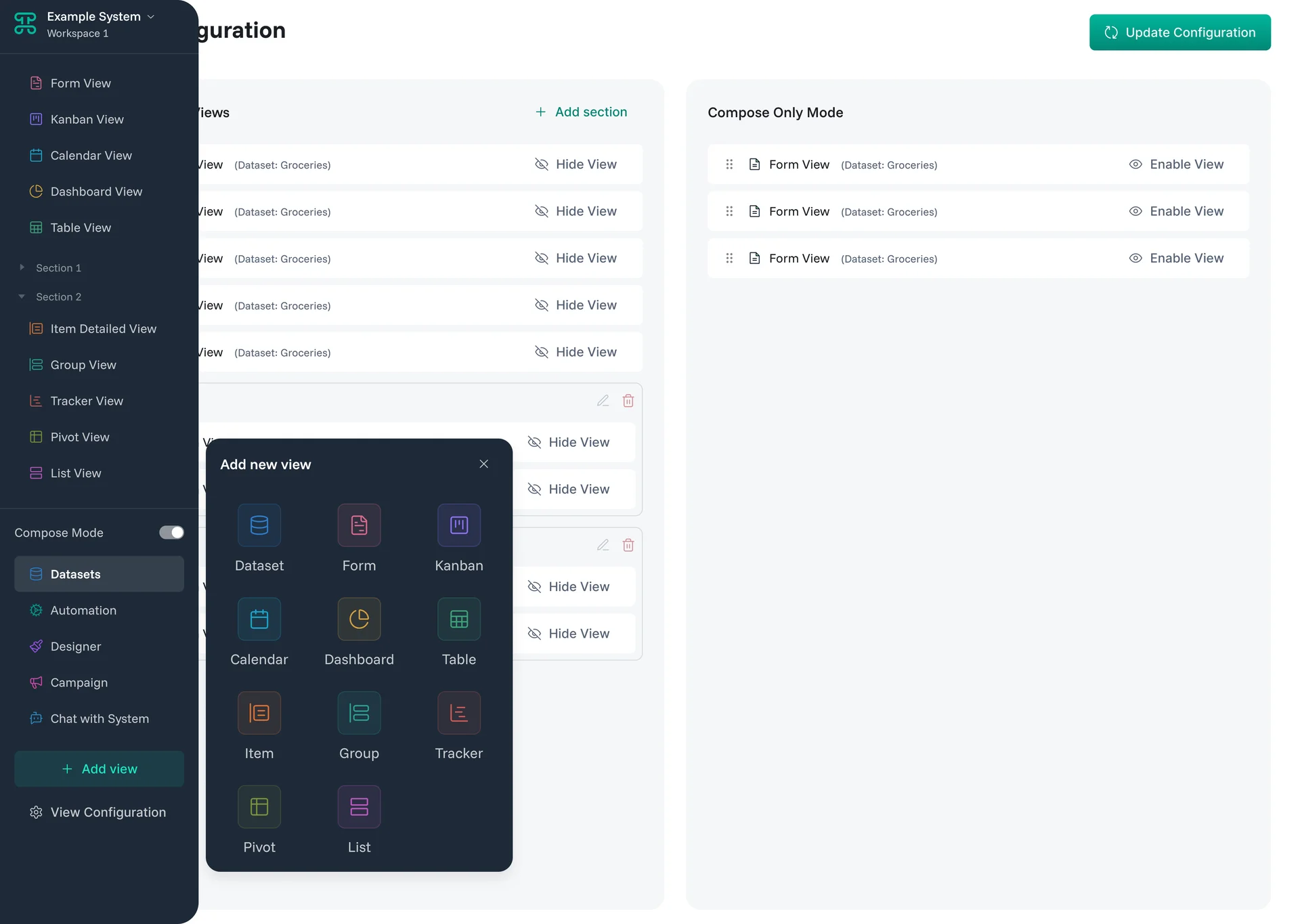
Creating new interfaces requires just a few clicks. Find the "+" or "Add New" button next to your existing tabs. Select the type that matches your workflow, give it a meaningful name, and watch your data reorganize into its new format.
Core Components
1. Interface Types
Every interface type serves a specific purpose. Understanding when to use each one transforms data chaos into organized workflows.
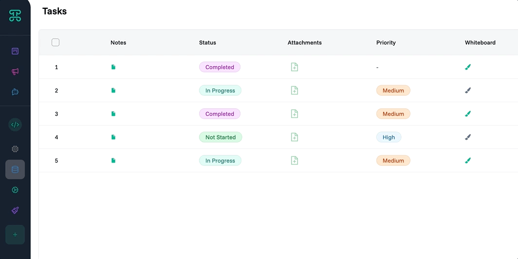
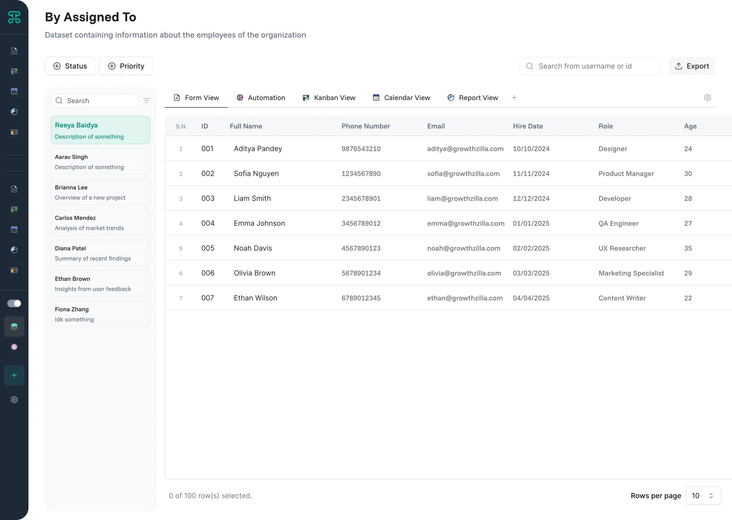
Table Interface
Your familiar spreadsheet view, enhanced with Proma's intelligence. Tables excel when you need to see many records at once, edit data directly, or export to Excel.
Structure & Behavior
Tables display data in rows and columns, just like Excel or Google Sheets. Each row represents a record, each column a field. But unlike static spreadsheets, Proma tables are dynamic—sort by any column, filter with complex logic, edit inline with validation, and see changes reflected everywhere instantly.
The power lies in direct manipulation. Click any cell to edit. Select multiple rows for bulk operations. Drag column borders to resize. Reorder columns by dragging headers. Every interaction feels natural to spreadsheet users while providing database-level consistency.
When to Use
Data Entry - Quickly input or update multiple records
Bulk Operations - Select and modify many items at once
Analysis - Sort, filter, and examine detailed data
Export - Prepare data for external systems
Configuration Options
Control which columns appear and their order by hovering over the bento menu icon (⋮⋮⋮) and dragging columns to rearrange. Select individual rows to access quick actions—delete, duplicate, or expand to detailed view.
Kanban Interface
Transform lists into visual workflows. Kanban boards show records as cards organized in columns, typically representing stages in a process.
Structure & Behavior
Each record becomes a card displaying key information. Columns represent states, stages, or categories. Drag cards between columns to update their status instantly.
Cards adapt to your data's story. A sales pipeline might surface customer name prominently with deal size and closing date below. Project workflows could lead with task titles, then show assignee avatars and color-coded priorities. Each card becomes a snapshot of what matters most—you control which fields appear, their order, and visual emphasis to create information hierarchies that match how your team thinks.
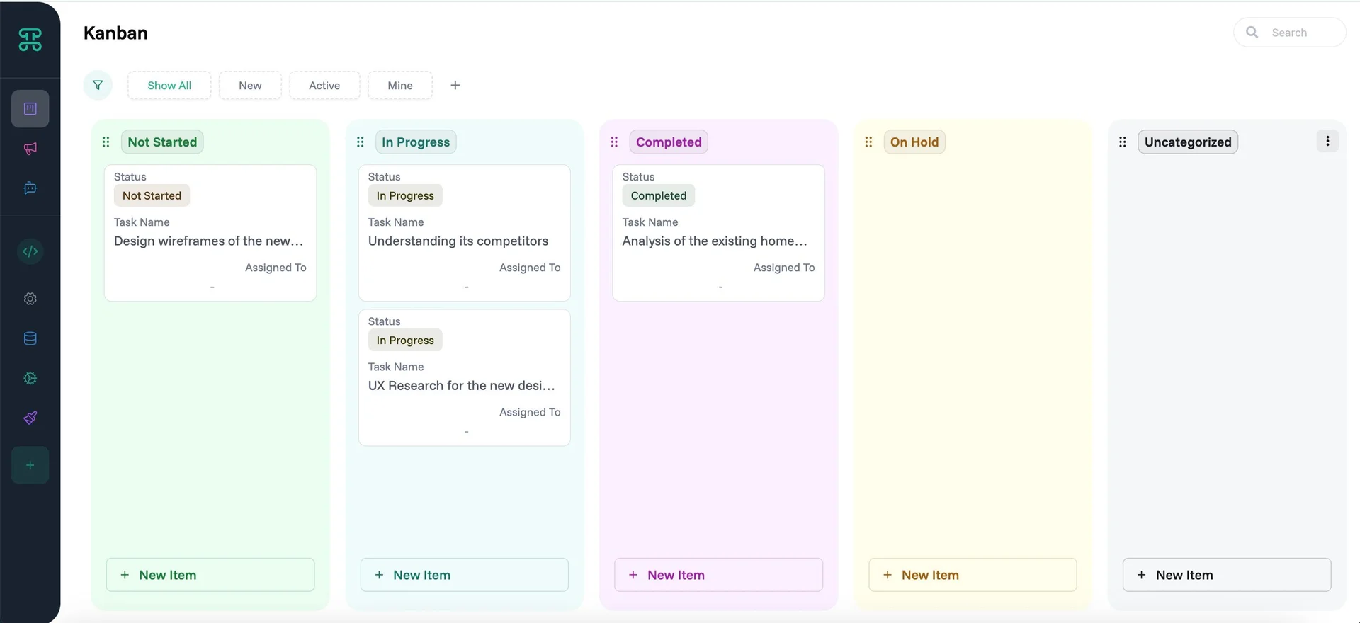
When to Use
Project Management - Track tasks through completion stages
Sales Pipelines - Visualize deals moving toward close
Support Tickets - Monitor issue resolution flow
Content Calendar - Manage content through editorial stages
Configuration Options
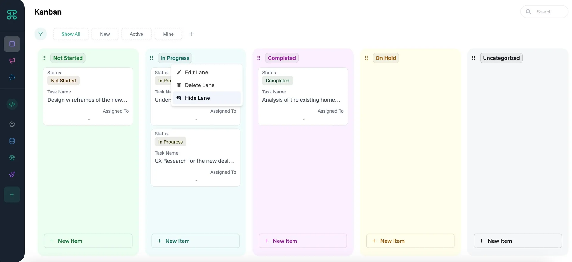
Each Kanban lane can be customized. Click on the three-dot menu (⋮) to access these options:
Edit - Fine-tune how cards behave within this lane:
Sort By: Choose which column sorts cards within the lane (Due Date, Priority, Created Date, or any field from your dataset)
Preview Tab: Customize which fields appear on the card face—keep it minimal for quick scanning
Detail Tab: Configure expanded view fields shown when cards are clicked—include all relevant information here
Apply Preview Settings to All Lanes: Sync your preview configuration across every lane for consistency
Apply Detail View Settings to All Lanes: Ensure detailed views match across the entire board
Delete Lane - Permanently remove this status/stage from your workflow. Cards in deleted lanes need reassignment to remaining lanes.
Hide Lane - Temporarily collapse lanes you're not actively working with. Hidden lanes preserve their cards and settings, reducing visual clutter without losing data.
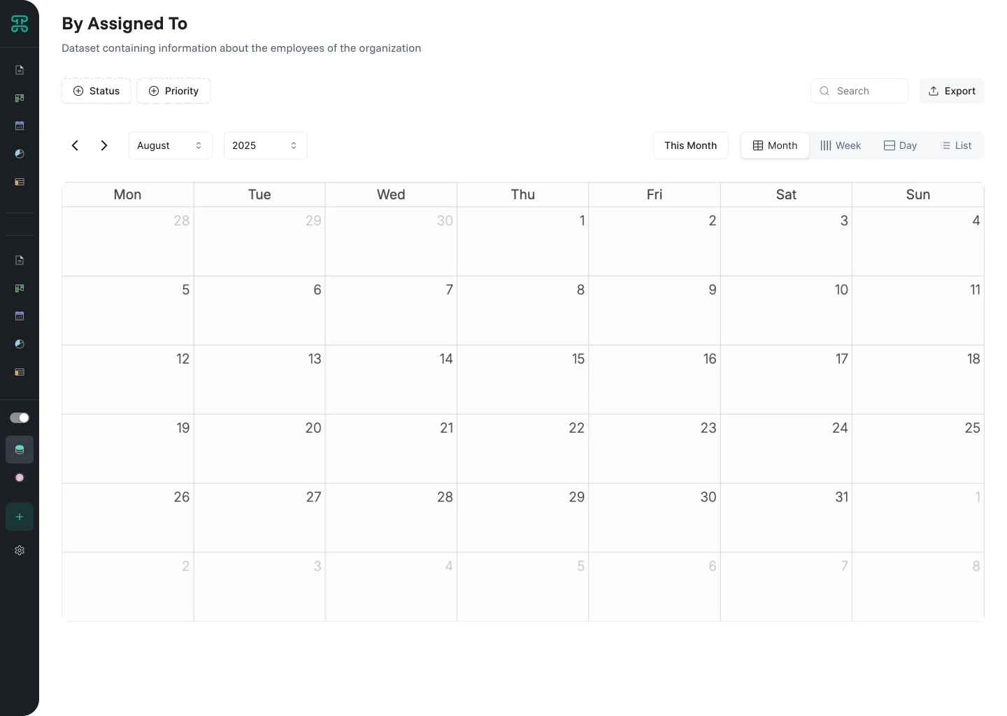
Calendar Interface
Time-based visualization for anything with dates. Calendar views reveal scheduling patterns, conflicts, and opportunities at a glance.
Structure & Behavior
Records appear as events on a traditional calendar layout. Switch between day, week, and month views based on needed detail. Drag events to reschedule. Resize events to adjust duration. Click empty slots to create new records with that date pre-filled.
Color coding adds another dimension. Distinguish event types, priorities, or assignees through color. Patterns emerge—Mondays are overloaded, afternoons are free, certain project types cluster together.
When to Use
Resource Scheduling - Manage people, rooms, or equipment
Project Planning - Visualize deadlines and milestones
Event Management - Coordinate multiple activities
Content Publishing - Plan and track release schedules
Configuration Options
Specify which date field drives calendar placement. Set default view (day/week/month). Enable or disable drag-and-drop rescheduling. Configure timezone handling for global teams.
Dashboard Interface
Your business intelligence hub. Dashboards transform raw data into visual insights, helping you spot trends and make informed decisions at a glance.
Structure & Behavior
Think of dashboards as your personal command center built from widgets—modular blocks that each tell part of your data story:
Line Charts: Show trends over time like monthly sales growth
Bar Charts: Compare values across categories like performance by region
Pie Charts: Visualize proportions like market share breakdown
Scatter Charts: Reveal correlations between variables like price vs. customer satisfaction
Area Charts: Display cumulative values over time like total inventory levels
Trend Charts: Highlight patterns and forecast future values based on historical data
Heatmaps: Show intensity across two dimensions like sales by hour and day of week
Text Charts: Present key insights or summaries in narrative form
Arrange these widgets in a flexible grid. Make important metrics larger. Group related information together. Everything updates automatically as your data changes—no manual refresh needed.
When to Use
Daily Operations: Monitor real-time performance and spot issues early
Team Meetings: Share progress and celebrate wins with visual proof
Client Reviews: Present professional reports that update themselves
Strategic Planning: Base decisions on actual data trends, not gut feelings
Configuration Options
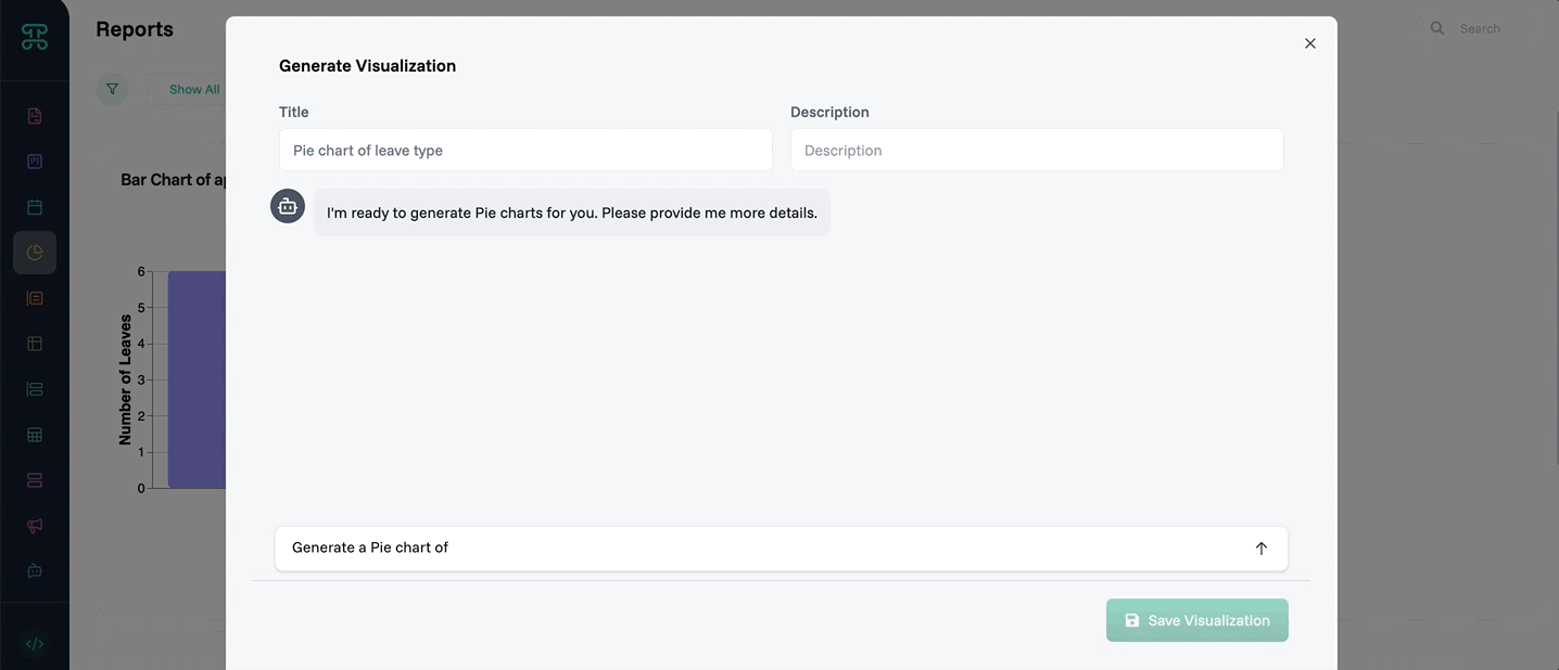
Building dashboards is refreshingly simple. Drag widgets where you want them. Resize by dragging corners. But here's the powerful part—use Proma's AI chatbot to customize everything through natural language:
Tell it "Make the revenue chart green" or "Change to dark theme"
Request "Show data as percentages instead of raw numbers"
Ask to "Generate a Pie chart of @Leave Type.label"
The chatbot understands context and applies changes instantly. No need to hunt through menus or remember specific settings. Just describe what you want to see, and watch your dashboard transform.
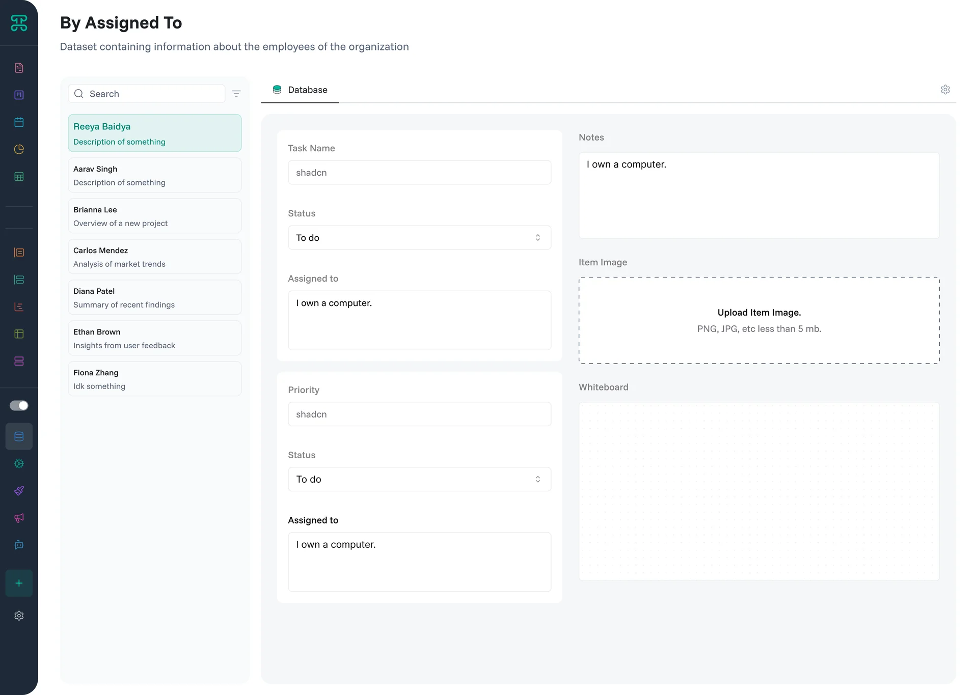
List Detail Interface
Browse your data as individual records with full context. List detail interfaces excel when you need to focus on one record at a time with all its details and relationships visible.
Structure & Behavior
Each record displays on its own page with all fields organized in logical sections. Navigate between records with previous/next buttons or jump directly via search. Related data appears in context—see all customer orders while viewing a customer record, or all tasks while viewing a project.
The layout adapts to your data structure. Image fields display prominently. Long text fields expand for comfortable reading. Related records show as clickable links. File attachments appear with preview capabilities.
When to Use
Customer Service - View complete customer history during support calls
HR Management - Review employee records with all documentation
Product Details - Display comprehensive information with images and specifications
Case Management - Access all case details, notes, and related documents
Configuration Options
Organize fields into collapsible sections for better navigation. Set which fields appear in the header for quick reference. Configure related data displays—choose which linked records to show and how many. Enable quick actions for common operations. Customize the layout to match your workflow, prioritizing important information at the top.
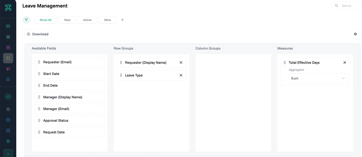
Pivot Interface
Transform flat data into multidimensional analysis. Pivot interfaces reveal patterns by reorganizing your data across different dimensions—like Excel pivot tables but with live data.
Structure & Behavior
Drag fields to row and column positions to create your analysis grid. Values automatically aggregate at intersection points. Add multiple dimensions for deeper analysis. Expand or collapse grouped data to control detail level.
For example, drag "Product" to rows and "Month" to columns to see sales by product over time. Add "Region" as a sub-row to break down each product by geographic performance. Values update instantly as underlying data changes.
When to Use
Sales Analysis - Compare performance across products, regions, and time periods
Resource Planning - View utilization by department, project, and month
Financial Reporting - Analyze expenses by category, department, and quarter
Inventory Management - Track stock levels by location, product, and supplier
Configuration Options
Choose aggregation methods for values—sum, average, count, min, max. Apply conditional formatting to highlight trends or outliers. Set up drill-through actions to see underlying records. Configure subtotals and grand totals. Export formatted results for presentations or further analysis.
Group Detail Interface
Organize large datasets into manageable clusters. Group interfaces create hierarchical views that make thousands of records navigable and understandable.
Structure & Behavior
Records automatically organize by your chosen grouping field. Each group shows as a collapsible section with record count. Expand groups to see their contents. Apply different views within each group—some might show as tables, others as cards.
Multi-level grouping creates nested hierarchies. Group by department, then by team, then by role. Each level maintains its own display settings and permissions. Collapsed groups show summary statistics.
When to Use
Organizational Charts - Group employees by department and team
Product Categories - Organize inventory by category and subcategory
Geographic Data - Group by country, state, and city
Employee Task Management - Group tasks by assignee, project, or status to see workload distribution
Configuration Options
Set grouping fields and hierarchy levels. Configure what summary information appears for collapsed groups. Choose different display formats for items within groups. Set default expanded/collapsed states. Enable group-level actions like bulk updates or exports.
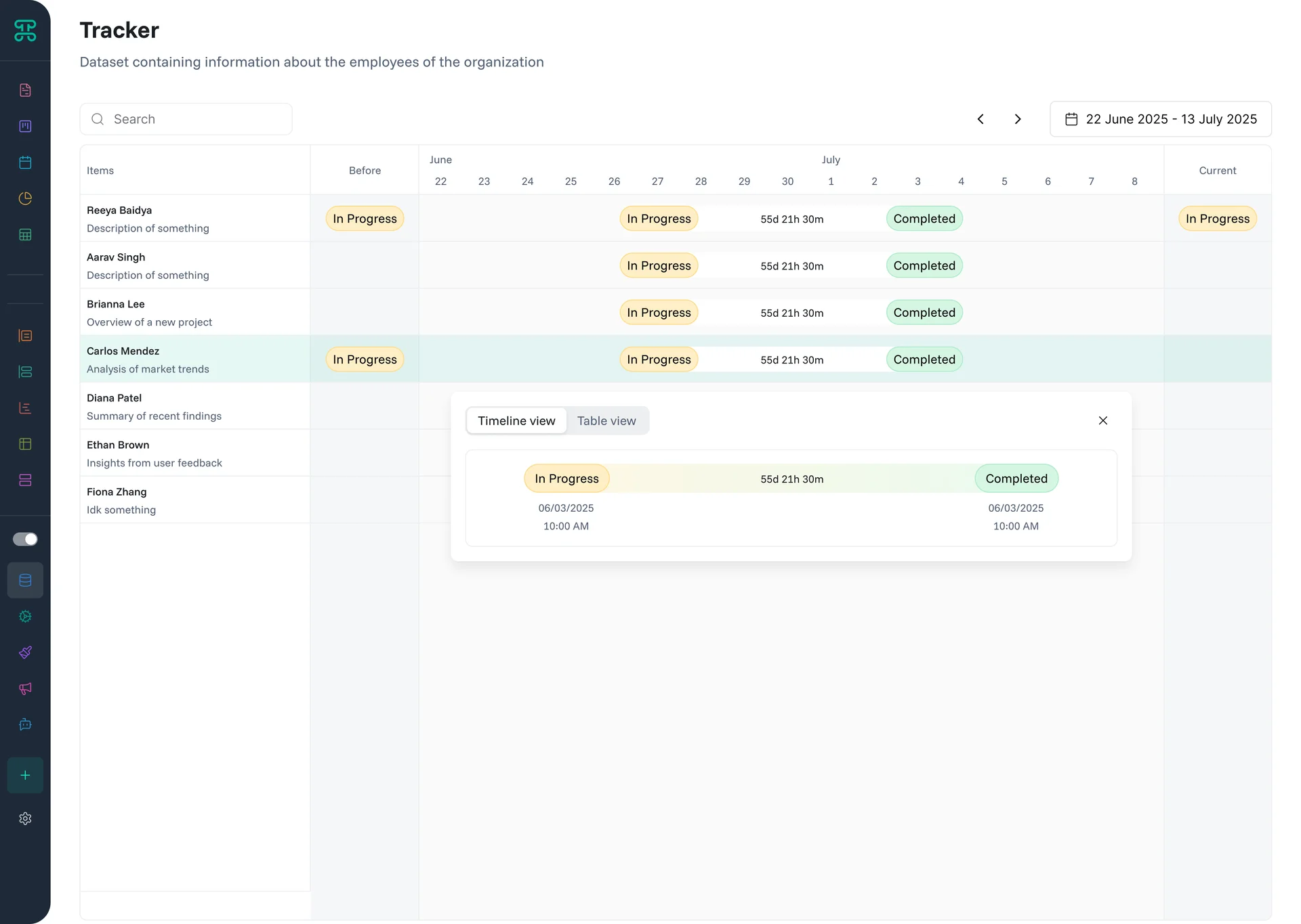
Tracker Interface
Monitor activities and changes over time. Tracker interfaces create audit trails and activity feeds that show who did what and when.
Structure & Behavior
Activities display in chronological order with timestamps and user attribution. Filter by user, action type, or date range. See before/after values for changes. Related activities group together for context.
Each entry shows essential information—the actor, action, affected record, and timestamp. Expand entries for full details including field-level changes. Color coding distinguishes action types—creates, updates, deletes.
When to Use
Audit Trails - Maintain compliance with change tracking
Project History - See evolution of tasks and milestones
Customer Interactions - Track all touchpoints in one timeline
System Monitoring - Watch for unusual activity patterns
Configuration Options
Choose which actions to track and display. Configure which columns you want to enable. Filter activity by date range to analyze specific time periods.
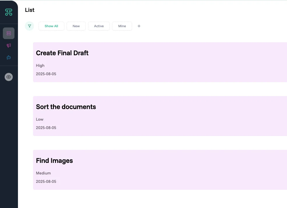
List Interface
Simple, scannable views for quick browsing and selection. List interfaces strip away complexity to show just what you need.
Structure & Behavior
Records appear as simple list items with key fields visible. Click items for details or actions. Multi-select for bulk operations. Search and filter to narrow results. Infinite scroll or pagination for large datasets.
Lists optimize for scanning speed. Consistent formatting helps pattern recognition. Visual indicators show status or priority. Hover reveals additional quick actions without cluttering the view.
When to Use
Task Lists - Quick overview of to-do items
Contact Lists - Browse and select people efficiently
Inventory Picking - Select items for orders or transfers
Approval Queues - Process items requiring action
Configuration Options
Choose between one or both display templates to match your needs. Mini Card Design shows compact items with 2-3 key fields, perfect for quick scanning through long lists. Card Design Template displays richer information with images and multiple fields, ideal when visual recognition matters. You can customize both mini and card templates in the Designer section to match your exact requirements. @Designer
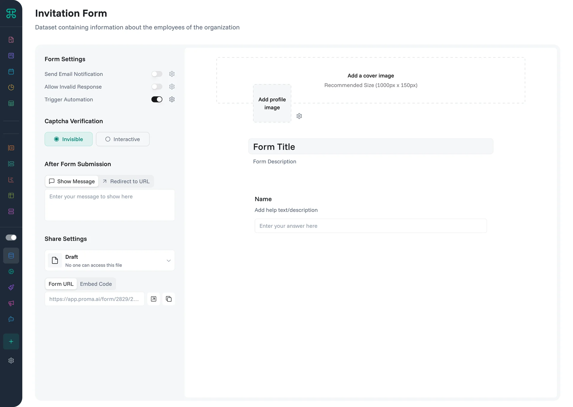
Form Interface
Collect information elegantly without exposing system complexity. Forms provide guided data entry for users who don't need full system access.
Structure & Behavior
Forms present fields in a logical flow with clear labels and help text. Support various input types—text, numbers, dates, dropdowns, file uploads. Include validation to ensure data quality. Show or hide fields based on previous answers. Submit data directly into your datasets.
Public forms work without login, perfect for customer feedback or lead capture. Internal forms can pre-populate based on logged-in user context. Confirmation messages and redirect options provide clear next steps.
When to Use
Lead Generation - Capture prospect information
Customer Feedback - Collect reviews and suggestions
Employee Requests - Process time-off or expense submissions
Event Registration - Manage attendee information
Configuration Options
Design multi-step forms with sections and page breaks for better organization. Build forms through an intuitive drag-and-drop interface—simply drag fields from your dataset into the form builder.
Form Settings control core behavior:
Send Email Notification - Automatically email form responses to designated recipients
Allow Invalid Response - Choose whether to accept partial submissions or enforce all validations
Trigger Automation - Connect form submissions to automated workflows
After Form Submission options guide user experience:
Show Message - Display a custom thank you message
Redirect to URL - Send users to a specific page after submission
Share Settings determine form accessibility:
Draft - Form in development, not accessible to users
Private - Only logged-in users with permissions can access
Public - Anyone with the link can submit responses
Form Distribution provides multiple sharing methods:
Form URL - Direct link to share via email or messaging
Embed Code - HTML snippet to integrate forms into websites
Field Configuration for each form element offers granular control:
Visibility Options - Control when fields appear:
Always - Field is always visible to all users
Private - Only visible to logged-in users with appropriate permissions
Conditional - Show/hide based on logic rules
Disabled - Field appears but users cannot interact with it
Hidden - Field exists in form but is completely invisible (useful for tracking data)
Default Values - Pre-populate fields intelligently:
Use Last Saved Value - Remember user's previous entry for convenience
Set static default values (e.g., "Vacation or Personal time" for a leave type field)
Configure dynamic defaults based on user context or current date
URL Parameters - Accept values from web addresses:
Set from URL - Enable fields to capture data from URL parameters
Query Parameter Key - Define the specific parameter name to watch for
Perfect for pre-filling forms from email links or marketing campaigns
2. Interface Controls
Beyond choosing the right type, interfaces provide controls that refine how data appears and behaves.
View Controls
Every interface includes controls that adjust what you see without changing underlying data.
Slice Your Data - Filter by any variable in your dataset through an intuitive dropdown menu. Each field becomes a filterable dimension, letting you instantly narrow down to exactly what matters. Select multiple values within each field or combine filters across different fields for precise data views.
Quick Filters - Access pre-built filters for common scenarios:
Show All: Remove all filters to see complete dataset
New: Display recently created records
Active: Focus on current, non-archived items
Mine: Show only records assigned to you
Create a Filter - Build sophisticated filter logic using the visual Logic Builder. Combine multiple conditions with AND/OR operators, create nested logic groups, and save complex filters for repeated use. While other platforms require writing formulas, Proma's Logic Builder lets you construct powerful filters through drag-and-drop.
Column Customization - Reorder columns by dragging. Adjust column widths for optimal viewing. Your preferences save automatically and persist between sessions.
Data Export - Download your filtered data anytime in CSV or Excel format. Exports respect your current filters and column selections, giving you exactly what you see on screen. Perfect for offline analysis, sharing with stakeholders, or creating backups.
Building Interfaces
Create Your First Interface
Time to first interface: 3 minutes
This example creates a Kanban board for project management.
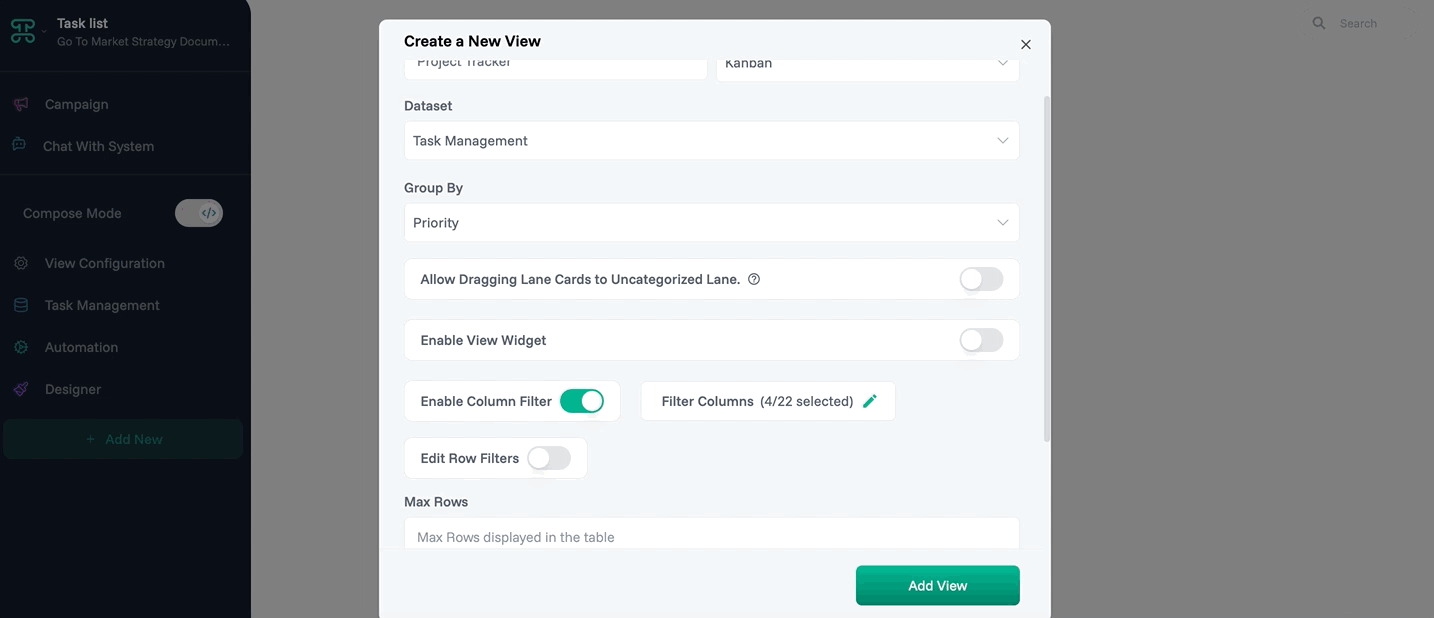
Step 1: Access Interface Creation
Open your tasks dataset
Click the "+" tab
Select "Kanban Board"
Name it "Project Tracker"
Step 2: Configure Columns
Columns appear: To Do, In Progress, Review, Done
Drag to reorder columns if needed
Step 3: Design Cards
Click "Configure Cards"
Add fields: Task Name, Assignee, Due Date, Priority, Status
Enable color coding by Priority
Step 4: Set Permissions
Team: Can edit (drag cards)
Stakeholders: View only
Save configuration
✓ Done! Your team can now visualize project flow.
Choosing the Right Interface for Your Data
The power of Proma lies in presenting the same data in multiple ways, but choosing the wrong interface can create confusion and reduce productivity. This guide helps you select the optimal interface based on your data characteristics, user needs, and business objectives.
Decision Framework
Start with User Intent
Before selecting an interface type, understand what users need to accomplish:
Data Discovery - Users need to explore and understand data patterns
Best Choice: Dashboard Interface for trends and insights
Alternative: Pivot Interface for multidimensional analysis
Task Execution - Users need to complete specific actions on records
Best Choice: Kanban Interface for workflow-based tasks
Alternative: List Interface for simple task completion
Data Entry - Users need to create or update information
Best Choice: Form Interface for structured input
Alternative: Table Interface for bulk edits
Monitoring & Tracking - Users need to observe changes over time
Best Choice: Calendar Interface for time-based events
Alternative: Tracker Interface for activity history
Decision Making - Users need to analyze and compare options
Best Choice: Table Interface for detailed comparison
Alternative: Group Interface for categorical analysis
Consider Data Characteristics
Your data's inherent structure guides interface selection:
Time-Sensitive Data (events, deadlines, schedules)
Primary: Calendar Interface - visualizes temporal relationships
Secondary: Tracker Interface - shows chronological activity
Process-Oriented Data (tasks, deals, tickets)
Primary: Kanban Interface - visualizes workflow stages
Secondary: Group Interface - organizes by status categories
Hierarchical Data (organizations, categories, locations)
Primary: Group Interface - shows natural hierarchies
Secondary: List Interface - simplified browsing
Analytical Data (metrics, KPIs, performance)
Primary: Dashboard Interface - visual insights at a glance
Secondary: Pivot Interface - detailed cross-tabulation
Detailed Records (customers, products, cases)
Primary: Item Interface - comprehensive single-record view
Secondary: Table Interface - efficient multi-record comparison
Collection Data (surveys, applications, registrations)
Primary: Form Interface - guided data capture
Secondary: Table Interface - bulk processing
Interface Selection Matrix
Data Type | Primary Interface | When to Use | Secondary Option | When to Switch |
Projects/Tasks | Kanban | Visual workflow, status tracking | Table | Bulk updates, detailed planning |
Events/Meetings | Calendar | Scheduling, timeline view | List | Quick browsing, simple agendas |
Sales/Deals | Kanban | Pipeline management | Dashboard | Performance analysis |
Customer Records | Item | Detailed service interactions | Table | Data updates, comparisons |
Inventory | Table | Stock management, pricing | Group | Category organization |
Financial Data | Dashboard | Trend analysis, reporting | Pivot | Detailed breakdowns |
Employee Info | Group | Org chart, team structure | Table | HR data management |
Support Tickets | Kanban | Resolution workflow | Tracker | Audit trail, escalations |
Content/Documents | List | Quick browsing, selection | Item | Full document review |
Survey/Forms | Form | Data collection | Table | Response analysis |
Troubleshooting
Common Interface Issues
When interfaces misbehave, systematic investigation reveals solutions.
Loading Problems
Slow Initial Load often stems from too much data or complex calculations. Check default filters—are you loading all historical records? Review field count—do you need every column? Examine calculated fields—are they computing for every row?
Solution progression: Add reasonable default filters → Remove unnecessary fields → Optimize calculations → Consider summary interfaces for large datasets
Refresh Failures manifest as stale data or error messages. Verify permissions haven't changed. Check if source dataset structure modified. Confirm external data sources remain accessible. Review automation dependencies.
Enable interface logs to capture detailed error information. Cross-reference with automation run logs for complete picture.
Display Anomalies
Missing Records that exist in datasets but not interfaces usually indicate filter issues. Check all active filters, including hidden default filters. Verify record permissions—the interface might hide records the user cannot access. Review grouping settings that might collapse categories.
Incorrect Calculations in dashboards or calculated fields need systematic debugging. Verify source data accuracy first. Check calculation logic for edge cases—nulls, zeros, date boundaries. Confirm timezone handling for time-based calculations. Test with known values to isolate issues.
Permission Conflicts
Access Denied errors require checking the full permission chain. Start at space level—does the user have access? Check dataset permissions next. Finally verify interface-specific settings. Remember permissions only restrict, never expand.
Partial Access where some features work but others don't indicates granular permission issues. Check field-level permissions for editing problems. Verify action permissions for button failures. Review bulk operation settings for selection issues.
Performance Optimization
When interfaces slow down, targeted optimizations restore speed.
Data Volume Solutions
Pagination breaks large datasets into manageable chunks. Configure page size based on typical usage—50 records for detailed review, 200 for quick scanning. Implement smart loading that fetches next page before users reach bottom.
Archiving moves historical data out of primary views. Create archive datasets for records older than your operational window. Build separate interfaces for historical analysis. Maintain links between current and archived data for complete pictures.
Summary Interfaces aggregate data rather than showing every record. Instead of displaying 10,000 sales transactions, show daily totals. Drill-down navigation lets users explore details when needed. Pre-calculate summaries during off-hours for instant display.
Query Optimization
Index Usage dramatically improves filter performance. Work with your admin to ensure commonly filtered fields have indexes. Sort fields benefit especially. Date fields used in ranges need careful index design.
Filter Simplification reduces processing overhead. Complex nested conditions slow queries. Flatten where possible. Replace multiple OR conditions with IN clauses. Avoid negative conditions (NOT EQUAL) when positive conditions work.
Calculated Field Strategies balance convenience with performance. Calculate once and store for stable values. Calculate on-demand for volatile data. Use backend calculations for complex logic. Cache results when appropriate.
User Experience Issues
When users struggle despite functional interfaces, design optimizations help.
Information Overload
Progressive Simplification starts with user feedback. Which fields do they actually use? What decisions do they make? Remove unused elements. Group related information. Use visual hierarchy to guide attention.
Create role-specific interfaces rather than one-size-fits-all. Sales reps need different fields than sales managers. New users benefit from simplified views while experts want everything accessible.
Smart Defaults reduce repetitive actions. Pre-select common filter combinations. Set initial sort orders that surface important items. Configure default groupings that match mental models. Save user preferences between sessions.
Navigation Confusion
Clear Way finding helps users understand where they are. Use descriptive interface names that indicate purpose. Add breadcrumbs showing current location. Provide clear paths between related interfaces. Include help text explaining interface purpose.
Consistent Architecture creates predictable experiences. If table interfaces are for data entry, maintain that pattern. If dashboards are read-only, keep them that way. Users should predict interface behavior from its type.
Next Steps
Explore related Proma features that enhance interface capabilities:
@Logic Builder - Create complex conditional workflows with visual programming
@Smart Columns - Add intelligent, automated fields to your datasets
@Automation Engine - Build automated workflows that respond to interface interactions
Have questions? Our team is ready to help at support@proma.ai