Introduction
Every business needs to present information clearly, but creating polished interfaces from scratch takes weeks of development time and technical expertise your team doesn't have. Traditional approaches force you to choose between generic templates that don't match your needs and custom development that drains resources. Your sales team needs proposal layouts, your operations team wants status dashboards, your customer service needs ticket displays—each requiring different information arranged in specific ways. Without proper design tools, teams resort to static documents, spreadsheets, or clunky default views that confuse users and slow decision-making.
The Designer transforms your raw data into purposeful, professional interfaces—custom cards that display exactly the right information for each workflow, organized layouts that guide user attention, and responsive designs that work seamlessly across devices. It's about turning your data into experiences that make your team more effective, your customers more satisfied, and your business more polished.
What is the Designer?
The Designer enables you to create custom interface layouts and card designs that transform how your data is displayed and interacted with. Build visual templates without code to present information beautifully and functionally.
Common use cases include creating customer onboarding cards, project status displays, product catalogs, team dashboards, and approval workflows with branded, professional appearances.
Getting Started
Accessing the Designer
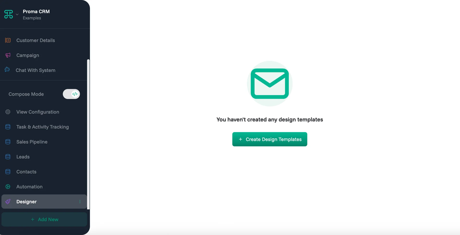
The path to custom design begins in any Board within your workspace. Look for the "Build Mode" toggle in your left sidebar—this switches your Board from viewing to building. Once enabled, a "Designer" section appears, opening the visual template builder where you'll craft your custom interfaces.
The builder presents a canvas with component libraries and layout tools, creating designs that mirror your business needs and brand identity.
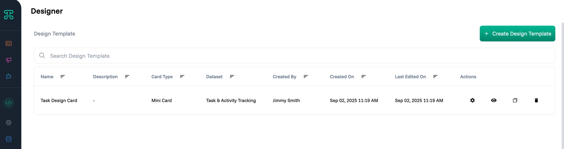
Template Library
The template library provides centralized management for all your design assets with powerful organization and maintenance features.
Search and Filter Quickly locate specific templates using name-based search or filter by card type, dataset, creator, or creation date. Essential for organizations with extensive template libraries.
Version Control Track template evolution with creation and modification timestamps. See who made changes and when, enabling collaboration while maintaining design consistency.
Template Actions Each template supports multiple management operations:
Settings: Modify template configuration and properties
Preview: See how the template renders with sample data
Duplicate: Create copies for variations or experimentation
Delete: Remove templates no longer needed
Core Components
1. Basic Components
Every design starts with fundamental building blocks. Proma provides essential components that form the foundation of your custom interfaces. All components connect to your data through an intuitive drag-and-drop system—simply drag any field from your dataset onto a component to establish the data connection.
Text Display static or dynamic text content with full formatting control. Use text components for titles, descriptions, labels, and any written content. Support for variable binding means your text automatically updates with live data—customer names, order details, status updates flow directly from your datasets into your designs.
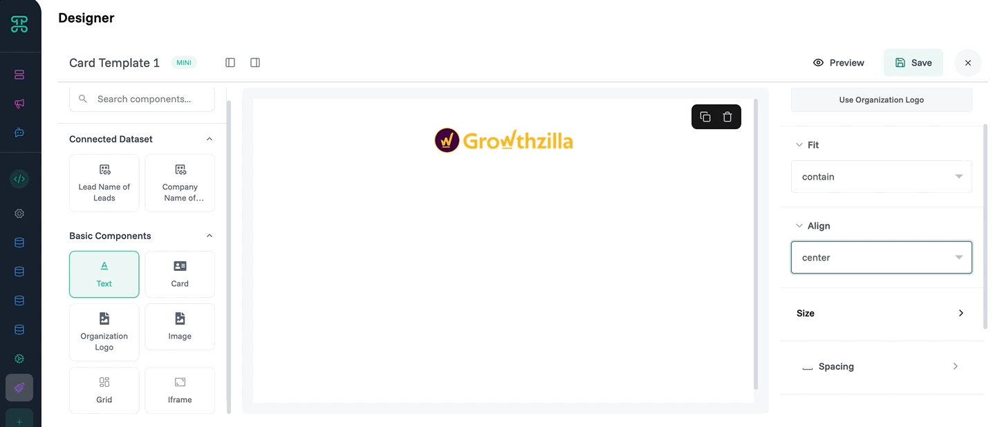
Organization Logo Automatically displays your organization's branding. Maintains consistency across all custom designs while adapting to different card sizes and layouts. The logo component ensures every interface reinforces your brand identity.
Image Display pictures, graphics, or visual content from your datasets or static sources. Product photos, team headshots, project screenshots—images bring data to life and create more engaging user experiences.
Grid Provides structured layout control with rows and columns. Grid components ensure your information aligns properly across different screen sizes and maintains professional appearance. Essential for forms, comparison tables, and any layout requiring precise positioning.
Iframe Embed external content directly into your designs. Display web pages, documents, videos, or other online resources without forcing users to navigate away. Perfect for integrating third-party tools or displaying related content.
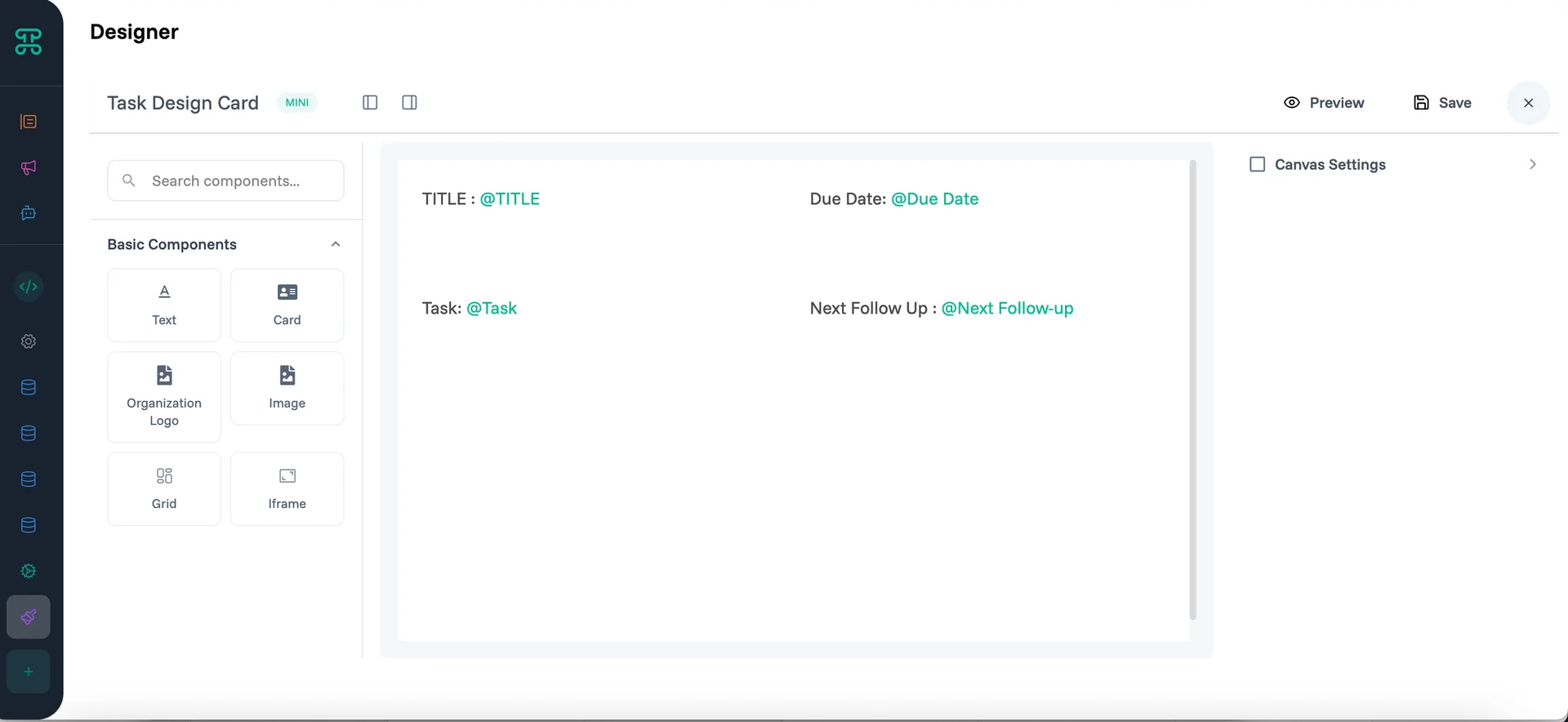
3. Card Types
Designer offers three card format options to match different use cases and information density requirements.
Nano Card Compact format for displaying essential information in minimal space. Perfect for dashboard overviews, quick status updates, or when screen real estate is limited. Nano cards excel at showing key metrics, simple status indicators, or brief summaries that users can scan quickly.
Mini Card Balanced format providing more space while maintaining compact footprint. Ideal for displaying moderate amounts of information—customer contact details, task summaries, or product previews. Mini cards offer enough room for multiple data points without overwhelming the interface.
Card Full-featured format with maximum space for comprehensive information display. Use standard cards for detailed customer profiles, complete project overviews, or any scenario requiring extensive information presentation. These cards accommodate rich layouts with multiple sections, images, and complex data relationships.
Building Custom Designs
Create Your First Template
Time to first custom design: 10 minutes
This example creates a customer onboarding card that displays customer information with approval status.
Access the Designer
Open your Board → Toggle "Build Mode" → Click "Designer" → Select "Create Design Template"
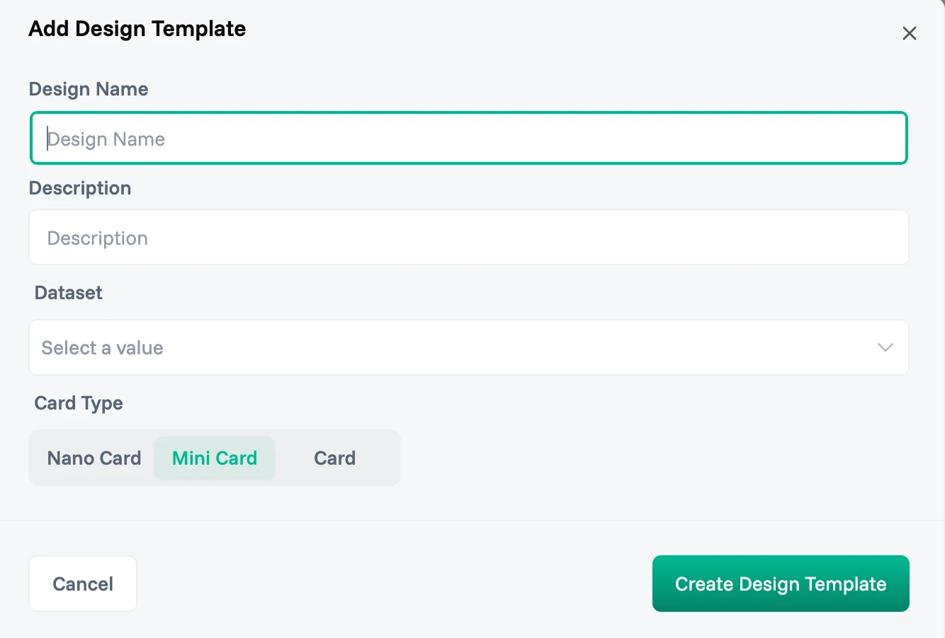
Configure Template Basics
Name: Use clear, specific names that indicate the template's purpose and usage context. "Customer Onboarding Card" tells you more than "Card Template 1"
Description: "Displays customer information with onboarding status and approval workflow" Good descriptions help team members understand when and how to use each template, especially important as your template library grows.
Dataset: Select the dataset containing the information your design will display. This connection enables dynamic content—your template pulls live data from the chosen dataset, ensuring displays always show current information.
Card Type: Choose the appropriate format based on your content requirements and display context. Consider information density, available screen space, and user workflow when selecting between Nano, Mini, or standard Card formats.
Design the Layout
Add Header Section:
Drag Organization Logo to top-left
Add Text component for customer name with dynamic binding
Create Information Grid:
Use Grid component for structured layout
Add Text fields for customer details (email, phone, company)
Include Image component for customer photo if available
Configure Data Binding:
Link text components to dataset fields using variable syntax
Set up conditional formatting based on customer status
Configure approval workflow connections
Test and Deploy
Save template → Preview with sample data → Apply to customer dataset
✓ Done! Your custom customer onboarding cards now display across your customer views.
Best Practices
Design Principles
Consistency First — Establish design standards early and apply them across all templates. Use consistent colors, fonts, spacing, and component placement. This creates professional appearance and helps users navigate different interfaces intuitively. A unified design system might specify that all status indicators use the same color scheme, all headers follow identical typography, and all action buttons maintain consistent styling.
Information Hierarchy — Guide user attention through thoughtful layout and visual weight. Most important information should be largest and most prominent. Group related data together. Use whitespace effectively to create clear sections and prevent visual clutter.
Mobile Responsiveness — Design templates that work across different screen sizes. Test your layouts on various devices to ensure information remains accessible and actionable on mobile. Consider how grid layouts adapt and whether touch targets are appropriately sized.
User-Centric Design — Focus on what users need to accomplish with your interface. Sales teams need quick access to contact information and deal status. Project managers need progress indicators and team assignments. Design for the workflow, not just the data.
Performance Optimization
Component Efficiency — Use appropriate components for your content. Don't embed complex iframes when simple text would suffice. Choose nano cards for overview displays and reserve full cards for detailed views. Efficient component selection improves loading times and user experience.
Data Binding Strategy — Bind only necessary data to reduce processing overhead. If your template displays customer name and status, don't bind the entire customer record. Selective binding improves performance and reduces potential security exposure.
Image Optimization — Compress images appropriately for their display size. Large product photos don't need full resolution when displayed as thumbnails. Optimize images to balance visual quality with loading speed.
Maintenance and Updates
Regular Template Audits — Review template library periodically to identify unused or outdated designs. Remove templates that no longer serve business needs. Update designs to reflect current branding and data structure changes.
Documentation Standards — Maintain clear documentation for complex templates. Note any special configuration requirements, data dependencies, or usage guidelines. Future team members will appreciate detailed documentation when modifying existing templates.
Version Management — Use descriptive naming for template iterations. When updating existing templates, consider duplicating first to preserve working versions. Test updates thoroughly before deploying to production datasets.
Troubleshooting
Template Not Displaying
When custom templates don't appear as expected, start with basic verification steps.
Check Template Assignment — Verify the template is properly assigned to your dataset view. Template assignment happens at the view level, not globally. Ensure you've selected the correct template for the current view configuration.
Verify Data Connections — Confirm all data bindings reference valid fields in your dataset. Field name changes or dataset modifications can break template connections. Review variable bindings and update any references to renamed or deleted fields.
Review Permissions — Ensure users have appropriate access to both the template and underlying data. Template visibility follows dataset permissions—users who can't access the data won't see the custom display.
Design Layout Issues
Visual layout problems often stem from component configuration or browser compatibility.
Grid Alignment Problems — Check grid column and row configurations. Misaligned content usually indicates incorrect span settings or conflicting component sizes. Use browser developer tools to inspect actual layout rendering and identify spacing issues.
Responsive Behavior — Test templates across different screen sizes to identify responsive design problems. Components that look perfect on desktop might overflow or stack incorrectly on mobile devices. Adjust grid settings and component sizing for better responsive behavior.
Browser Compatibility — Some advanced layout features may not render consistently across all browsers. Test your templates in the browsers your team uses most frequently. Consider fallback designs for browsers with limited CSS support.
Performance Problems
Slow-loading templates impact user productivity and satisfaction.
Large Image Files — Optimize images for web display. Product photos, logos, and user avatars should be compressed appropriately. Consider implementing lazy loading for image-heavy templates to improve initial load times.
Complex Data Binding — Simplify templates that bind extensive datasets or perform complex calculations. Break complex templates into simpler components or consider pre-calculating values in your dataset rather than computing them in the template.
Too Many Components — Templates with dozens of components can impact rendering performance. Evaluate whether all components provide value to users. Sometimes simpler designs deliver better user experience than feature-rich but slow interfaces.
Next Steps
Explore related Proma features that enhance design capabilities:
@Automation Engine - Connect your custom designs to automated workflows that respond to user interactions
@Smart Columns - Add intelligent, computed fields that enhance your template data sources
@Interfaces - Build complete application interfaces that incorporate your custom card designs
Have questions? Our team is ready to help at support@proma.ai